A camping equipment store must do more than look outdoorsy. It has to help shoppers picture real moments: setting up before rain, finding a headlamp after dark, or choosing a lantern bright enough for dinner outside.
Good website design makes those choices feel simple and turns “I might need this” into “This is right for my trip.”
Understand How Campers Actually Shop
Most people do not browse camping equipment in a neat technical order. They shop around a trip, a season, or a problem. Someone may need family campsite gear, while another wants lightweight lighting for a trail. Your website should reflect that natural behavior instead of forcing everyone through a plain product grid.
Use homepage sections that speak to real needs:
- Weekend camping essentials
- Camping lighting for campsites
- Lightweight hiking gear
- Family camping comfort items
This helps SEO because searches often sound practical. People look for “best camping lantern for tent” or “camping equipment for beginners,” not just “outdoor products.” When your design follows those searches, the store feels useful immediately.
Build A Visual Identity That Feels Clear And Reliable
Camping websites can easily overdo the adventure look. Huge mountain photos, dark backgrounds, and dramatic textures may look exciting, but they can make product details harder to read. A better approach is to keep the outdoor feeling while making the store clean, bright, and trustworthy.
In the early branding stage, a tool like text logo generator can help you test simple wordmark directions before choosing a final logo. The best camping store logo should look clear in a small mobile header, product label, or order confirmation email.
Important note: outdoor branding should support shopping. If the design looks adventurous but product pages feel vague, shoppers will still hesitate.
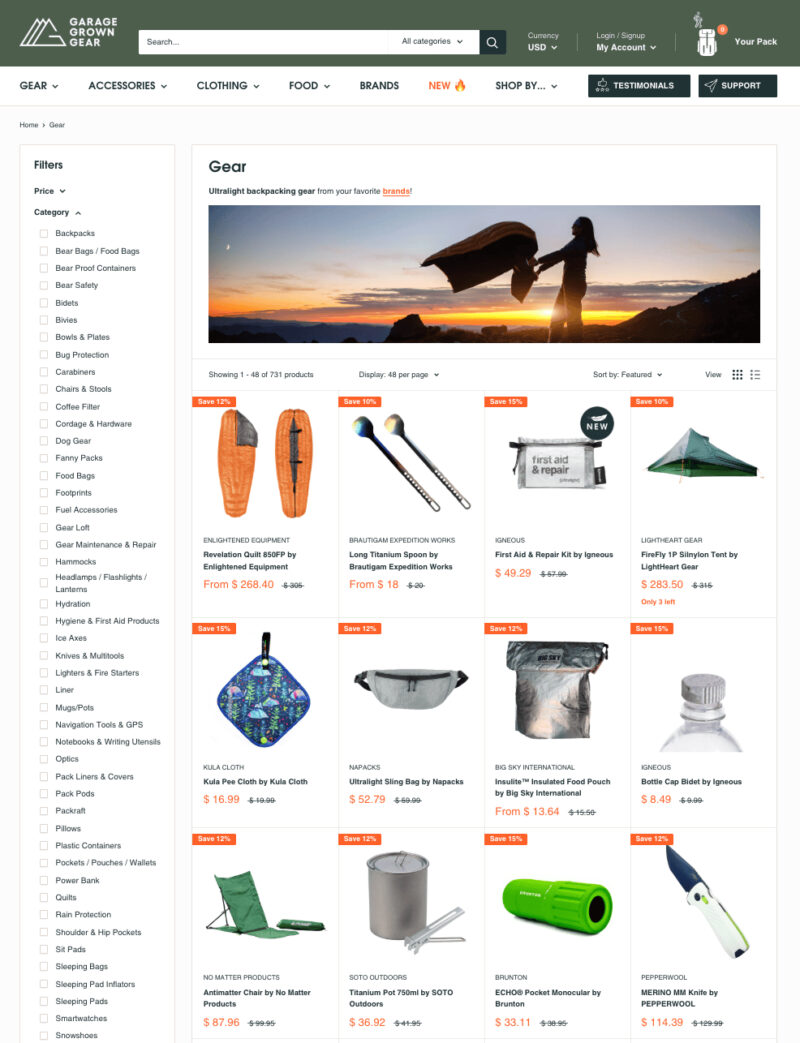
Make Category Pages Work Like Buying Guides
Category pages should do more than display products. For camping lighting, explain lanterns, headlamps, flashlights, tent lights, and string lights before the shopper starts comparing. A little guidance at the top saves people from opening every product just to understand the basics.
Filters should match real outdoor decisions. For lighting, include brightness, battery type, waterproof rating, weight, and best use. For tents, include capacity, season rating, packed size, and setup.
| Category | Helpful Filter | Why It Helps |
| Lanterns | Lumens and battery life | Matches light level to campsite use |
| Headlamps | Beam distance and weight | Helps with walking, cooking, and setup |
| Tents | Capacity and season rating | Prevents poor fit for weather or group size |
After the table, keep the product grid clean. Guidance should make browsing faster, not heavier.
Write Product Pages That Remove Doubt

A camping product page should answer the questions shoppers would ask in person. Does the lantern hang inside a tent? Is the headlamp comfortable for long use? Does the tent really fit four people with bags? Specs matter, but plain explanations matter just as much.
For camping lighting, show battery life, charging type, brightness modes, water resistance, and best use. For tents, explain the difference between sleeping capacity and comfortable capacity. For sleeping bags, explain temperature ratings simply.
Strong product pages should include real photos, close-ups of clips or ports, simple spec explanations, and clear stock, delivery, return, and warranty information. This is where trust grows. When shoppers feel informed, they are less likely to leave and compare somewhere else.
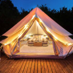
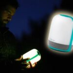
Show Camping Lighting In Real Outdoor Situations
Camping lighting is highly visual, so product images should show more than a lamp on a white background. Shoppers want to understand glow, beam spread, size, and placement. A lantern hanging inside a tent explains more than five lines of copy. A headlamp lighting a path shows what the beam actually does.
Use realistic scenes where the light has a clear job. Show a campsite table, tent interior, knife pocket, or night walkway. Keep the images honest. If a light creates a soft glow, show that. If it is powerful and focused, show the beam clearly.
Did you know? For lighting products, scale is almost as important as brightness. A hand-held photo can quickly show whether an item is pocket-sized, table-sized, or better suited for car camping.
Design Mobile Shopping For Fast Decisions
Many customers browse camping gear on their phones while planning trips, comparing options in-store, or checking delivery times before a weekend away. Mobile design has to be quick and calm. If filters are hidden too deeply or specs are cramped, people lose patience.
Keep mobile product cards focused. Show the name, price, rating, main use, and one key spec. For camping lighting, that spec might be lumens or battery life. For tents, it might be capacity or packed weight. Avoid making shoppers tap five times just to compare basics.
Mobile pages should prioritize fast-loading images, sticky filters, easy-to-tap buttons, and visible delivery information. A clean mobile experience feels practical, which fits the camping niche perfectly.
Use SEO Content To Help Before You Sell
Google’s guidance around helpful content focuses on creating pages for people first, not just search engines. For a camping store, that means writing content that genuinely helps shoppers choose, pack, compare, and prepare. A buying guide should not feel like a keyword container. It should feel like useful advice from someone who understands outdoor decisions.
Good topics include camping lighting checklists, family campsite setup tips, rechargeable versus battery-powered lanterns, and beginner camping equipment lists. Use keywords naturally in headings, image alt text, product descriptions, and internal links.
Keep the rhythm simple: start with the camper’s problem, explain the practical choice, then link to the right category or product group. That keeps content helpful, search-friendly, and connected to sales.
Final Thoughts
A strong camping equipment website feels practical from the first page to the final checkout.
It organizes products around real trips, explains technical details plainly, shows gear in believable outdoor situations, and makes mobile browsing easy.
When the design helps people choose with confidence, the store becomes more than a catalog. It becomes part of the trip planning process.
FAQs
1. Should a camping store separate beginner and advanced gear?
Yes. Beginner sections reduce confusion, while advanced filters give experienced shoppers the detail they expect.
2. How many photos should product pages have?
Use enough photos to answer practical questions. For most gear, five to eight strong images are better than one polished studio shot.
3. Should camping equipment stores add packing checklists?
Yes. Packing checklists are useful for shoppers and can naturally connect visitors to product categories they may have forgotten.